Visual Data Analysis in Python: Part 1
Introduction
- In the field of Machine Learning, data visualization plays a critical role beyond creating visually appealing graphics for reports. It is a powerful tool that is extensively utilized throughout all stages of a project.
- Data visualization serves as a crucial step in the initial exploration of data when tackling a new task. It allows us to conduct preliminary checks, perform analysis, and summarize the data efficiently using graphics and tables. By visualizing the data, we can quickly grasp the main points and extract valuable insights without getting lost in the intricacies of raw data.
- In the context of model analysis and reporting, the utilization of charts and images remains crucial. Visual representations play a vital role in understanding model performance, interpreting complex models (projecting high-dimensional spaces onto more visually intelligible 2D or 3D figures), and conveying results effectively.
- Visualization serves as a fast and effective approach to gain insights and understand your data. It is essential to learn and utilize various visualization techniques as part of your everyday Machine Learning toolbox.
- In this article, we will focus on acquiring hands-on experience with data visual exploration by leveraging popular libraries such as pandas, matplotlib, and seaborn. These libraries offer powerful tools and functions to create meaningful visualizations, enabling you to uncover patterns, relationships, and anomalies in your data.
1. Data
Similar to the article on Data analysis article, The UCI Adult Income dataset is used for this article. It contains information about individuals from the 1994 United States Census, and the goal is to predict whether a person’s income exceeds $50,000 per year based on various attributes. It consists of 14 attributes, including features such as age, education level, work-class, marital status, occupation, race, sex, capital gain, capital loss, hours per week, native country, and the target variable, which indicates whether the income exceeds $50,000 or not.
Setup
- Importing the necessary libraries:
- Import the Matplotlib library, which is a popular visualization library in Python.
- Import the NumPy library, which provides support for numerical operations and array manipulation.
- Import the Pandas library, which is widely used for data manipulation and analysis.
- Importing and setting up Seaborn:
- Import the Seaborn library, which is built on top of Matplotlib and offers additional functionality and aesthetics for data visualization.
- Set the default Seaborn theme, providing a consistent and visually pleasing style for the plots.
# import required libs
import matplotlib.pyplot as plt
import numpy as np
import pandas as pd

# use the Seaborn library
import seaborn as sns

#sets the default Seaborn theme
sns.set()

# Configures the Jupyter Notebook to display the plots in SVG format, which ensures sharper and more legible graphics.
%config InlineBackend.figure_format = 'svg'

# setup precision for two decimal places
pd.set_option("display.precision", 2)

# read csv from URL into a dataframe
DATA_URL = "https://vmlverse.github.io/assets/datasets/adult.data.csv"
df = pd.read_csv(DATA_URL)
1. df.head(n)
The head() function displays the top rows of the DataFrame data. By specifying the argument 5 (default value), it will show the first 5 entries of the DataFrame. This provides a quick overview of the structure and content of your data, allowing you to get acquainted with the dataset.
df.head()
| age | workclass | fnlwgt | education | education-num | marital-status | occupation | relationship | race | sex | capital-gain | capital-loss | hours-per-week | native-country | salary | |
|---|---|---|---|---|---|---|---|---|---|---|---|---|---|---|---|
| 0 | 39 | State-gov | 77516 | Bachelors | 13 | Never-married | Adm-clerical | Not-in-family | White | Male | 2174 | 0 | 40 | United-States | <=50K |
| 1 | 50 | Self-emp-not-inc | 83311 | Bachelors | 13 | Married-civ-spouse | Exec-managerial | Husband | White | Male | 0 | 0 | 13 | United-States | <=50K |
| 2 | 38 | Private | 215646 | HS-grad | 9 | Divorced | Handlers-cleaners | Not-in-family | White | Male | 0 | 0 | 40 | United-States | <=50K |
| 3 | 53 | Private | 234721 | 11th | 7 | Married-civ-spouse | Handlers-cleaners | Husband | Black | Male | 0 | 0 | 40 | United-States | <=50K |
| 4 | 28 | Private | 338409 | Bachelors | 13 | Married-civ-spouse | Prof-specialty | Wife | Black | Female | 0 | 0 | 40 | Cuba | <=50K |
For the UCI Adult income dataset, the target variable is the “income” column, which indicates whether an individual’s income exceeds a certain threshold. It is also a binary variable with two possible values:
<=50K: Indicates that the individual’s income is less than or equal to $50,000 per year.>50K: Indicates that the individual’s income is greater than $50,000 per year.
The goal is to predict whether an individual’s income falls below or exceeds the $50,000 threshold based on the remaining features in the dataset. This is why we call it a target variable.
2. Univariate visualization
- Univariate analysis focuses on examining individual features or variables one at a time.
- It involves analyzing the distribution and characteristics of a single feature without considering other variables in the dataset.
- This allows us to gain insights specifically related to that feature.
- Below are some common statistical types of features and the corresponding tools for their individual visual analysis:
2.1 Quantitative features
Quantitative features in a dataset are characterized by ordered numerical values. These values can be discrete, like integers, or continuous, like real numbers, and usually express a count or a measurement.
Histograms and density plots
To visualize the distribution of a numerical variable, one of the easiest ways is to plot its histogram using the hist() method of a DataFrame. Here’s an example:
features = ["hours-per-week","age"]
df[features].hist(figsize=(10, 4));
Histogram:
- A histogram is a visualization that groups values into bins of equal value range, providing insights into the distribution of a feature.
- The shape of the histogram can offer clues about the underlying distribution type, such as Gaussian (bell-shaped), exponential, or others.
- It allows you to identify any skewness or anomalies in the distribution.
Why Histogram of a Feature matters in ML?:
- Understanding the distribution of feature values becomes crucial when applying Machine Learning methods that assume a specific distribution type, often Gaussian.
- Some algorithms, like linear regression or Gaussian Naive Bayes, rely on the assumption of a Gaussian distribution for optimal performance.
- By examining the histogram, you can assess whether the feature follows a Gaussian distribution or if there are deviations from this assumption.
Skewness:
- Skewness in the shape of the histogram can indicate departures from a regular distribution.
- Positive skewness (longer tail on the right) suggests that the data has a few large values, while negative skewness (longer tail on the left) indicates a concentration of small values.
- These observations can be valuable for understanding the data and selecting appropriate Machine Learning techniques.
In the above plot, we see that the variable hours-per-week appears like a normaal distrbution with a high distribution of values in 30-40 range, while age is positively skewed(its tail is longer on the right) with few large values.
Another effective way to understand the distribution of a variable is through density plots, also known as Kernel Density Plots. These plots provide a smoothed version of the distribution and offer advantages over histograms as they are not influenced by the choice of bin size.
df[features].plot(
    kind="density", subplots=True, layout=(1, 2), sharex=False, figsize=(10, 4)
);
It is also possible to plot a distribution of observations with seaborn’s distplot(). For example, let’s look at the distribution of age. By default, the plot displays the histogram with the kernel density estimate (KDE) on top.
QUICK TIP: KDE stands for Kernel Density Estimation. It is a non-parametric method used to estimate the probability density function of a continuous random variable. In simpler terms, KDE is a way to represent the underlying distribution of a set of data points in a smooth and continuous manner.
sns.distplot(df["hours-per-week"]);
<ipython-input-5-30db0f299d1e>:1: UserWarning:

`distplot` is a deprecated function and will be removed in seaborn v0.14.0.

Please adapt your code to use either `displot` (a figure-level function with
similar flexibility) or `histplot` (an axes-level function for histograms).

For a guide to updating your code to use the new functions, please see
https://gist.github.com/mwaskom/de44147ed2974457ad6372750bbe5751

  sns.distplot(df["hours-per-week"]);
The height of the histogram bars here is normed and shows the density rather than the number of examples in each bin.
Box plot
A box plot is a useful visualization for understanding the distribution and statistical properties of a variable. Seaborn provides an excellent implementation of box plots that offers valuable insights.
sns.boxplot(x="age", data=df);
Let’s see how to interpret a box plot. Its components are a box (obviously, this is why it is called a box plot), the so-called whiskers, and a number of individual points (outliers).
The box by itself illustrates the interquartile spread of the distribution; its length is determined by the \(25th(Q1)\) and \(75th(Q3)\) percentiles. The vertical line inside the box marks the median (\(50\%\)) of the distribution.
The whiskers are the lines extending from the box. They represent the entire scatter of data points, specifically the points that fall within the interval \((Q1\:-1.5*IQR,\: Q3\:+1.5*IQR)\), where \(IQR = Q3-Q1\) is the interquartile range.
Outliers that fall outside of the range bounded by the whiskers are plotted individually as black points along the central axis.
We can see that a large number of older customers is quite rare in our data.
IQR:
- The interquartile range (IQR) is a statistical measure that provides information about the spread or dispersion of a dataset. It is calculated as the difference between the third quartile (Q3) and the first quartile (Q1) of the dataset.
- The quartiles divide a dataset into four equal parts, representing different portions of the data distribution. The first quartile (Q1) represents the 25th percentile, meaning that 25% of the data falls below this value. The third quartile (Q3) represents the 75th percentile, indicating that 75% of the data falls below this value.
- To calculate the IQR, you subtract the first quartile (Q1) from the third quartile (Q3): IQR = Q3 - Q1.
- The IQR provides a measure of the range within which the central 50% of the data is contained. It is less sensitive to extreme values or outliers compared to the range, making it a robust measure of spread.
- By examining the IQR, you can assess the variability or dispersion of a dataset. A larger IQR indicates a wider spread of values, while a smaller IQR suggests a more concentrated or narrow range of values. The IQR is particularly useful when comparing distributions or detecting potential outliers within a dataset.
Violin plot
The last type of distribution plots that we will consider is a violin plot. A violin plot combines a box plot and a kernel density estimate (KDE) plot.
Look at the figures below. On the left, we see the already familiar box plot. To the right, there is a violin plot with the kernel density estimate on both sides.
_, axes = plt.subplots(1, 2, sharey=True, figsize=(6, 4))
sns.boxplot(data=df["age"], ax=axes[0])
sns.violinplot(data=df["age"], ax=axes[1]);
The figure on the right showcases a violin plot, which incorporates the features of a box plot along with the KDE on both sides. The width of the violin represents the density of the data at different values, with a wider section indicating a higher density of observations. The white dot inside the violin represents the median, and the vertical lines extending from the violin indicate the range of the data.
From the violin plot, we can now see the density of data distributions which is not evident in the box plot. For instance, there is a larger density in the lower whisker (<Q1), than the upper whisker (>Q3).
describe()
In addition to graphical tools, To obtain exact numerical statistics of the distribution, you can utilize the describe() method of a DataFrame. This method provides a summary of various descriptive statistics for each numerical column in the DataFrame.
df[features].describe()
| hours-per-week | age | |
|---|---|---|
| count | 32561.00 | 32561.00 |
| mean | 40.44 | 38.58 |
| std | 12.35 | 13.64 |
| min | 1.00 | 17.00 |
| 25% | 40.00 | 28.00 |
| 50% | 40.00 | 37.00 |
| 75% | 45.00 | 48.00 |
| max | 99.00 | 90.00 |
The table provides the count of non-null values, mean, standard deviation (std), minimum (min), quartiles (25%, 50%, 75%), and maximum (max) values for each numerical column. This information helps in understanding the distribution, detecting outliers, and assessing the overall characteristics of the data.
2.2 Categorical and binary features
- Categorical features take on a fixed number of values.
- Each of these values assigns an observation to a corresponding group, known as a category, which reflects some qualitative property of this example.
- Binary variables are an important special case of categorical variables when the number of possible values is exactly 2.
- If the values of a categorical variable are ordered, it is called ordinal.
Frequency table
First, we will get a frequency table, which shows how frequent each value of the categorical variable is. For this, we will use the value_counts() method:
df["salary"].value_counts()
<=50K    24720
>50K      7841
Name: salary, dtype: int64
By default, the entries in the output are sorted from the most to the least frequently-occurring values.
In our case, the data is not balanced; that is, our two target classes, <=50K & >50K, are not represented equally in the dataset. Only a small part of the people have salaries higher thana 50K. As we will see in the following articles, this fact may imply some restrictions on measuring the classification performance, and, in the future, we may want to additionally penalize our model errors in predicting the minority above 50k salaried class.
Bar plot
The bar plot is a graphical representation of the frequency table. The easiest way to create it is to use the seaborn’s function countplot(). There is another function in seaborn that is somewhat confusingly called barplot() and is mostly used for representation of some basic statistics of a numerical variable grouped by a categorical feature.
Let’s plot the distributions for two categorical variables:
_, axes = plt.subplots(nrows=1, ncols=2, figsize=(12, 4))

sns.countplot(x="salary", data=df, ax=axes[0])
sns.countplot(x="relationship", data=df, ax=axes[1]);
Histograms and bar plots have distinct characteristics and applications:
-
Histograms: Histograms are primarily used to analyze the distribution of numerical variables. They display the frequency or count of observations within specified intervals or bins. The x-axis of a histogram represents the numerical values, and the y-axis represents the frequency or density of observations. Histograms are suitable for understanding the shape, central tendency, and spread of continuous or discrete numerical data.
-
Bar plots: Bar plots, on the other hand, are used for visualizing categorical variables. They can represent various types of data on the x-axis, such as numbers, strings, or booleans. Bar plots display the categories on the x-axis and the corresponding frequencies, counts, or aggregated values on the y-axis. Bar plots are useful for comparing and presenting data across different categories or groups.
While histograms and bar plots may have similar appearances, they serve different purposes and handle different types of data. It is important to select the appropriate visualization based on the nature of the variable and the goal of analysis.
In the example mentioned, the histogram on the left illustrates the imbalance in the target variable, highlighting the disparity between the two classes. The bar plot on the right reveals the distribution of relationships and suggests that the Husbands are mostly the salaried people.
These visualizations serve as initial hypotheses and lay the groundwork for more advanced and powerful techniques to explore and analyze the data further.
3. Multivariate visualization
Multivariate plots are powerful tools that enable us to examine relationships between two or more variables in a single figure. The choice of visualization technique depends on the types of variables involved.
3.1 Quantitative vs. Quantitative
Correlation matrix
Let’s look at the correlations among the numerical variables in our dataset. This information is important to know as there are Machine Learning algorithms (for example, linear and logistic regression) that do not handle highly correlated input variables well.
First, we will use the method corr() on a DataFrame that calculates the correlation between each pair of features. Then, we pass the resulting correlation matrix to heatmap() from seaborn, which renders a color-coded matrix for the provided values:
# Drop non-numerical variables
numerical = list(set(
        [
            "age",
            "fnlwgt",
            "education-num",
            "capital-gain",
            "capital-loss",
            "hours-per-week",
        ]
    )
)

# Calculate and plot
corr_matrix = df[numerical].corr()
sns.heatmap(corr_matrix);
From the colored correlation matrix generated above, we can see that there are no variables that have been calculated directly from other variables. Thus there are no dependent variables and can therefore none of the numerical columns can be left out since they all contribute additional information that may be useful.
Incase, if we end up finding the presense of direct variables in our dataset, we can get rid of them as they do not contribute any additional information.
Scatter plot
The scatter plot displays values of two numerical variables as Cartesian coordinates in 2D space. Scatter plots in 3D are also possible.
Let’s try out the function scatter() from the matplotlib library:
plt.scatter( df["hours-per-week"],df["capital-loss"]);
We get an uninteresting picture of these two variables - hours-per-week vs capital loss. However, looking closely we can determine that the people who work between 20 to 40 hours faced the highest capital losses.
There is a slightly fancier option to create a scatter plot with the seaborn library:
sns.jointplot(x="hours-per-week", y="capital-loss", data=df, kind="scatter");
The function jointplot() plots two histograms that may be useful in some cases.
Using the same function, we can also get a smoothed version of our bivariate distribution:
sns.jointplot(
    x="hours-per-week", y="capital-loss", data=df, kind="kde", color="g"
);
This is basically a bivariate version of the Kernel Density Plot discussed earlier.
Scatterplot matrix
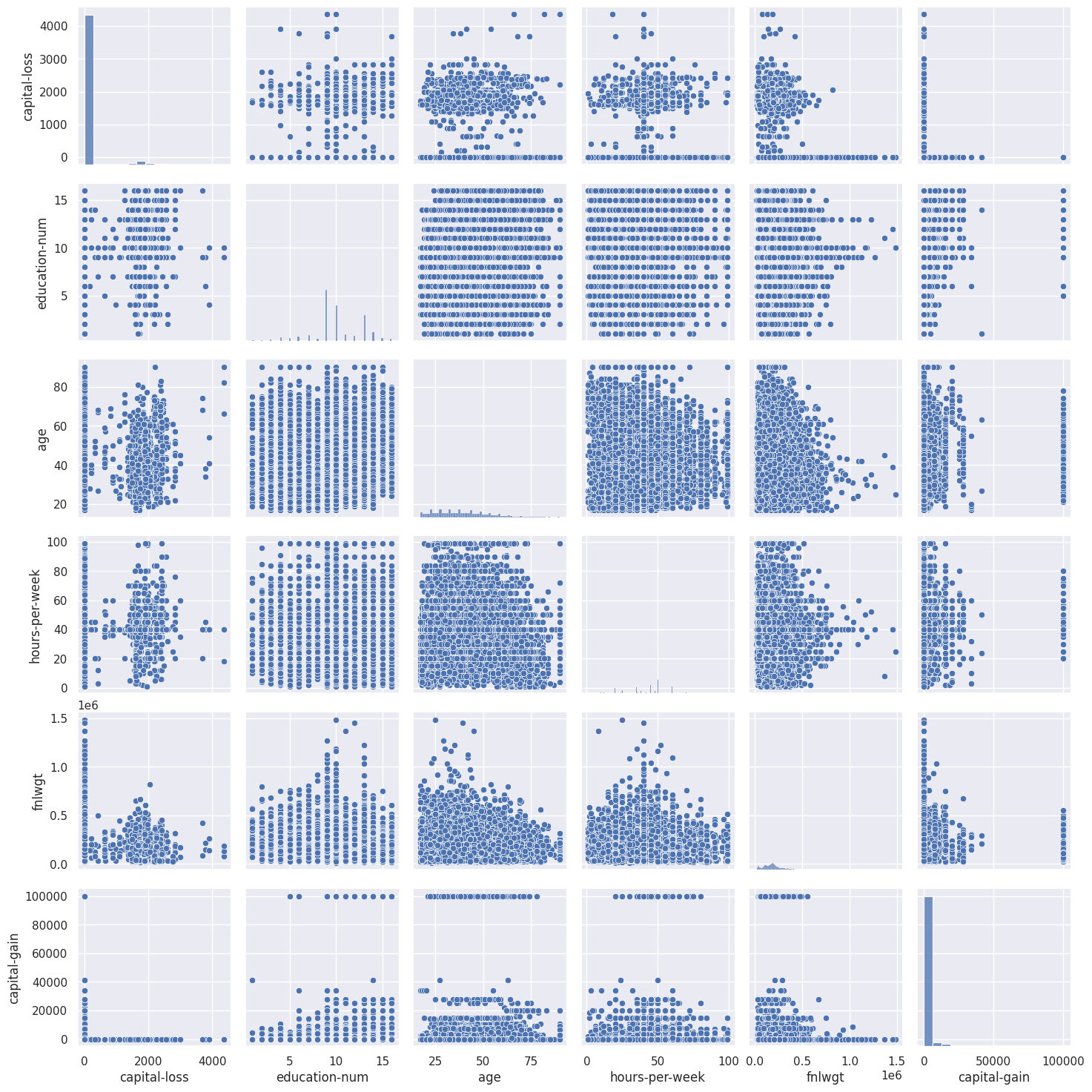
In some cases, we may want to plot a scatterplot matrix such as the one shown below. Its diagonal contains the distributions of the corresponding variables, and the scatter plots for each pair of variables fill the rest of the matrix.
# `pairplot()` may become very slow with the SVG format
%config InlineBackend.figure_format = 'png'
sns.pairplot(df[numerical]);
# instruct Jupyter Notebook to render the figures in SVG format
%config InlineBackend.figure_format = 'svg'
Sometimes, such a visualization may help draw conclusions about data; but, in this case, everything is pretty clear with no surprises.
3.2 Quantitative vs. Categorical
In this section, we will make our simple quantitative plots a little more exciting. We will try to gain new insights for 50K salary prediction from the interactions between the numerical and categorical features.
More specifically, let’s see how the input variables are related to the target variable Salary.
Previously, you learned about scatter plots. Additionally, their points can be color or size coded so that the values of a third categorical variable are also presented in the same figure. We can achieve this with the scatter() function seen above, but, let’s try a new function called lmplot() and use the parameter hue to indicate our categorical feature of interest:
sns.lmplot(
    x="hours-per-week", y="capital-loss", data=df, hue="salary", fit_reg=False
);
It seems that our small proportion of >50K customers lean towards the bottom and mid of capital loss; that is, such >50K customers tend to work from 0 hours to 100 hours per week. But this is not absolutely clear, and we won’t make any definitive conclusions from this chart.
Now, let’s create box plots to visualize the distribution statistics of the numerical variables in two disjoint groups: the <=50K and those who earn >50K.
fig, axes = plt.subplots(nrows=3, ncols=4, figsize=(10, 7))
for idx, feat in enumerate(numerical):
    ax = axes[int(idx / 4), idx % 4]
    sns.boxplot(x="salary", y=feat, data=df, ax=ax)
    ax.set_xlabel("")
    ax.set_ylabel(feat)
fig.tight_layout();
From this chart, we can see that the greatest discrepancy in distribution between the two groups is for two variables: age and education-num. Later in this course, we will learn how to determine feature importance in classification using Random Forest or Gradient Boosting; there, we will see that the first two features are indeed very important for salary prediction.
Let’s look at the distribution of age for the <=50K aand >50K customers separately. We will create box and violin plots for age grouped by the target variable.
_, axes = plt.subplots(1, 2, sharey=True, figsize=(10, 4))

sns.boxplot(x="salary", y="age", data=df, ax=axes[0])
sns.violinplot(x="salary", y="age", data=df, ax=axes[1]);
In this case, the violin plot does not contribute any additional information about our data as everything is clear from the box plot alone: high earners tend to be older people.
An interesting observation: the high earners have an early starting age as the <50K people but the high earners also tend to stop earning 10 years earlier than the <=50K people.
When we want to analyze a quantitative variable in two categorical dimensions at once, there is a suitable function for this in the seaborn library called catplot(). For example, let’s visualize the interaction between age and two categorical variables in the same plot:
sns.catplot(
    x="salary",
    y="age",
    col="marital-status",
    data=df,
    kind="box",
    col_wrap=4,
    height=3,
    aspect=0.9,
);
From this, we could conclude that, the Married-civ-spouse are least group with high income earners.
3.3 Categorical vs. Categorical
As we saw earlier in this article, the variable relationship has few unique values and, thus, can be considered either categorical. We have already seen its distribution with a count plot. Now, we are interested in the relationship between this categorical feature and the target variable Salary.
Let’s look at the distribution of the relationship, again using a count plot. This time, let’s also pass the parameter hue=salary that adds a categorical dimension to the plot:
sns.countplot(x="relationship", hue="salary", data=df);
An observation: the husbands seems to be the high earners (>50K).
Now, let’s look at the relationship between Salary and the binary feature, sex. Lets also look at Salary and categorical fetaure marital-status.
_, axes = plt.subplots(1, 2, sharey=True, figsize=(10, 4))

sns.countplot(x="sex", hue="salary", data=df, ax=axes[0])
sns.countplot(x="marital-status", hue="salary", data=df, ax=axes[1]);
axes[1].tick_params(axis='x', rotation=45)
An observation: Married-civ-spouse males who are husbands seems to be the high earners.
Contingency table
In addition to using graphical means for categorical analysis, there is a traditional tool from statistics: a contingency table, also called a cross tabulation. It shows a multivariate frequency distribution of categorical variables in tabular form. In particular, it allows us to see the distribution of one variable conditional on the other by looking along a column or row.
Let’s try to see how Salary is related to the categorical variable Marital Status by creating a cross tabulation:
pd.crosstab(df["marital-status"], df["salary"]).T
| marital-status | Divorced | Married-AF-spouse | Married-civ-spouse | Married-spouse-absent | Never-married | Separated | Widowed |
|---|---|---|---|---|---|---|---|
| salary | |||||||
| <=50K | 3980 | 13 | 8284 | 384 | 10192 | 959 | 908 |
| >50K | 463 | 10 | 6692 | 34 | 491 | 66 | 85 |
4. Whole dataset visualizations
4.1 A naive approach
We have been looking at different facets of our dataset by guessing interesting features and selecting a small number of them at a time for visualization. We have only dealt with two to three variables at once and were easily able to observe the structure and relationships in data. But, what if we want to display all the features and still be able to interpret the resulting visualization?
We could use hist() or create a scatterplot matrix with pairplot() for the whole dataset to look at all of our features simultaneously. But, when the number of features is high enough, this kind of visual analysis quickly becomes slow and inefficient. Besides, we would still be analyzing our variables in a pairwise fashion, not all at once.
4.2 Dimensionality reduction
Most real-world datasets have many features, sometimes, many thousands of them. Each of them can be considered as a dimension in the space of data points. Consequently, more often than not, we deal with high-dimensional datasets, where entire visualization is quite hard.
To look at a dataset as a whole, we need to decrease the number of dimensions used in visualization without losing much information about the data. This task is called dimensionality reduction and is an example of an unsupervised learning problem because we need to derive new, low-dimensional features from the data itself, without any supervised input.
One of the well-known dimensionality reduction methods is Principal Component Analysis (PCA), which we will study later in this course. Its limitation is that it is a linear algorithm that implies certain restrictions on the data.
There are also many non-linear methods, collectively called Manifold Learning. One of the best-known of them is t-SNE.
4.3 t-SNE
The name of the method looks complex and a bit intimidating: t-distributed Stochastic Neighbor Embedding. Its math is also impressive, check out the original article by Laurens van der Maaten and Geoffrey Hinton from JMLR). Its basic idea is simple: find a projection for a high-dimensional feature space onto a plane (or a 3D hyperplane, but it is almost always 2D) such that those points that were far apart in the initial n-dimensional space will end up far apart on the plane. Those that were originally close would remain close to each other.
Essentially, neighbor embedding is a search for a new and less-dimensional data representation that preserves neighborship of examples.
First, we need to import some additional classes:
from sklearn.manifold import TSNE
from sklearn.preprocessing import StandardScaler
We will leave out the categorical features and convert the values “Male/”Female” of the binary feature Sex into numerical values using pandas.Series.map(); Similarly convert >50K and <=50K into 1 and 0s.
numerical_2 = list(set(
        [
            "age",
            "fnlwgt",
            "education-num",
            "capital-gain",
            "capital-loss",
            "hours-per-week",
            "sex",
            "salary"
        ]
    )
)
X = df[numerical_2]
X["sex"] = X["sex"].map({"Male": 1, "Female": 2})
X["salary"] = X["salary"].map({">50K": 1, "<=50K": 0})
<ipython-input-49-2ade905864e5>:15: SettingWithCopyWarning:
A value is trying to be set on a copy of a slice from a DataFrame.
Try using .loc[row_indexer,col_indexer] = value instead

See the caveats in the documentation: https://pandas.pydata.org/pandas-docs/stable/user_guide/indexing.html#returning-a-view-versus-a-copy
  X["sex"] = X["sex"].map({"Male": 1, "Female": 2})
<ipython-input-49-2ade905864e5>:16: SettingWithCopyWarning:
A value is trying to be set on a copy of a slice from a DataFrame.
Try using .loc[row_indexer,col_indexer] = value instead

See the caveats in the documentation: https://pandas.pydata.org/pandas-docs/stable/user_guide/indexing.html#returning-a-view-versus-a-copy
  X["salary"] = X["salary"].map({">50K": 1, "<=50K": 0})
We also need to normalize the data. For this, we will subtract the mean from each variable and divide it by its standard deviation. All of this can be done with StandardScaler.
QUICK TIP: StandardScaler is a preprocessing technique used in machine learning to standardize or scale features of a dataset. It transforms the features so that they have a mean of 0 and a standard deviation of 1. This process is also known as z-score normalization or standardization.
scaler = StandardScaler()
X_scaled = scaler.fit_transform(X)
Now, let’s build a t-SNE representation:
%%time
tsne = TSNE(random_state=17)
tsne_repr = tsne.fit_transform(X_scaled)
CPU times: user 10min 32s, sys: 739 ms, total: 10min 33s
Wall time: 7min 8s
and plot it:
plt.scatter(tsne_repr[:, 0], tsne_repr[:, 1], alpha=0.5);
Let’s color this t-SNE representation according to the churn (blue for <50K salaried people, and orange for those >50K salaries).
plt.scatter(
    tsne_repr[:, 0],
    tsne_repr[:, 1],
    c=df["salary"].map({'<=50K': "blue", '>50K': "orange"}),
    alpha=0.5,
);
We can see that customers who earn >50K are concentrated in a few areas of the lower dimensional feature space.
To better understand the picture, we can also color it with the remaining binary feature: sex. Orange dots here indicate the male instances.
_, axes = plt.subplots(1, 2, sharey=True, figsize=(12, 5))

for i, name in enumerate(["sex"]):
    axes[i].scatter(
        tsne_repr[:, 0],
        tsne_repr[:, 1],
        c=df[name].map({"Male": "orange", "Female": "blue"}),
        alpha=0.5,
    )
    axes[i].set_title(name);
From the above graph, we can interpret that the high income earners are mostly males with little female representation.
Finally, let’s note some disadvantages of t-SNE:
-
High computational complexity. The implementation in scikit-learn is unlikely to be feasible in a real task. If you have a large number of samples, you should try Multicore-TSNE instead.
-
The plot can change a great deal depending on the random seed, which complicates interpretation. Here is a good tutorial on t-SNE. In general, you shouldn’t make any far-reaching conclusions based on such graphs because it can equate to plain guessing. Of course, some findings in t-SNE pictures can inspire an idea and be confirmed through more thorough research down the line, but that does not happen very often.
References:
Twitter Facebook LinkedIn


Comments